Project Overview
Logo design for the new launch of Elisa Masmeier Breathwork, consulting, and bodywork, with the goal of making her values visible: calm, clear, and mindful, beyond common spiritual clichés.
The project took place over three weeks in December 2025 and included several rounds of feedback. I designed a distinctive wordmark and symbol with strong recognition value, complemented by carefully chosen typography that is also carried through to the website, reinforcing a consistent brand character.
Concept
The project started with a kickoff call and a shared questionnaire to better understand the brand’s values, goals, and core identity. As input, I received logo references and early website drafts, which also helped me gather additional insights into the desired tone and visual direction.
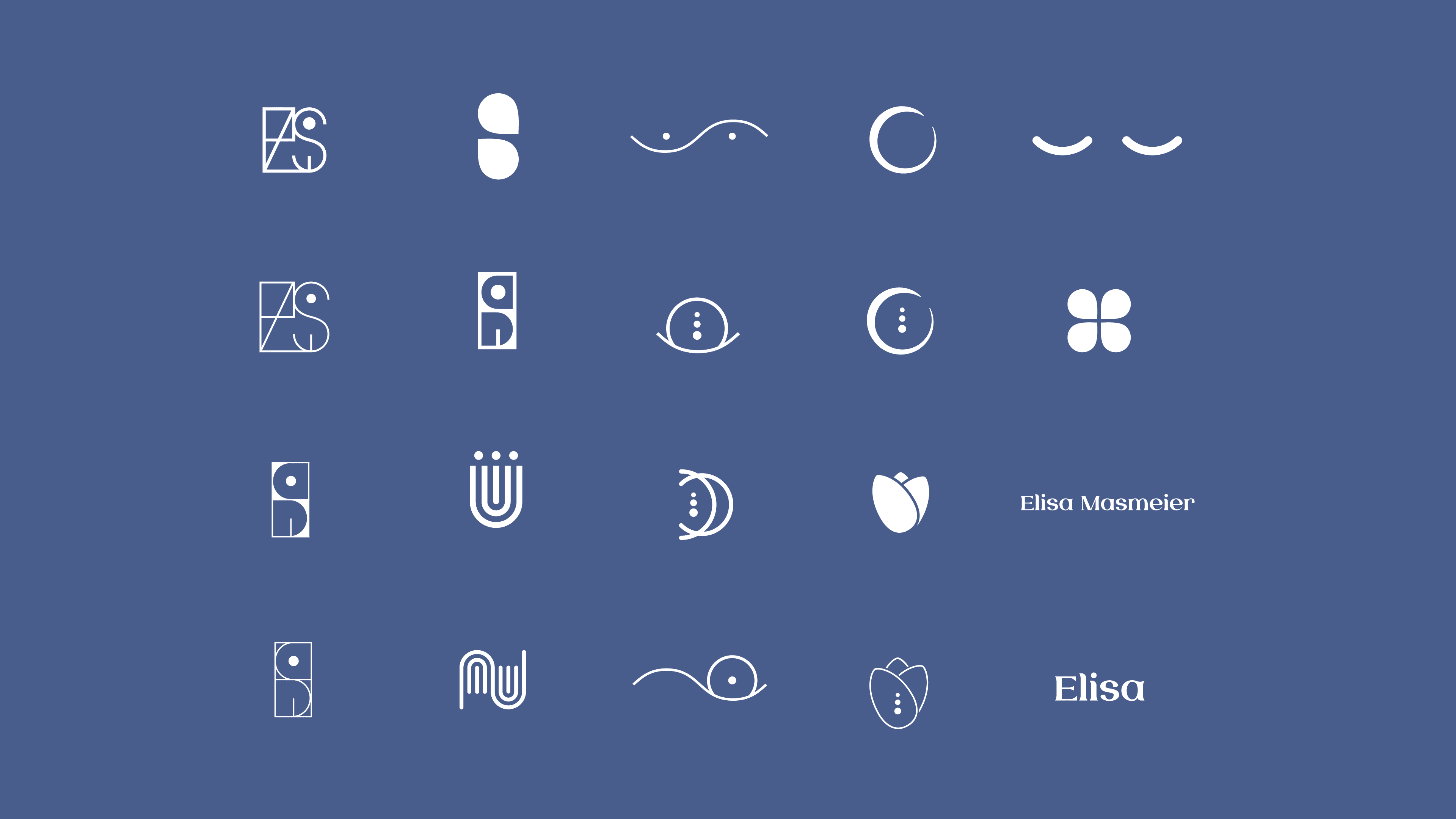
From there, I explored a wide range of initial logo concepts in different directions to identify which symbols and forms best fit her brand. I also looked at the market, especially yoga studios and similar brands, to understand existing best and worst practices.
During the process, it also became clear that the primary typeface used on the website did not match the brand. As a result, I added new typography suggestions to better align the overall visual identity.
Iteration
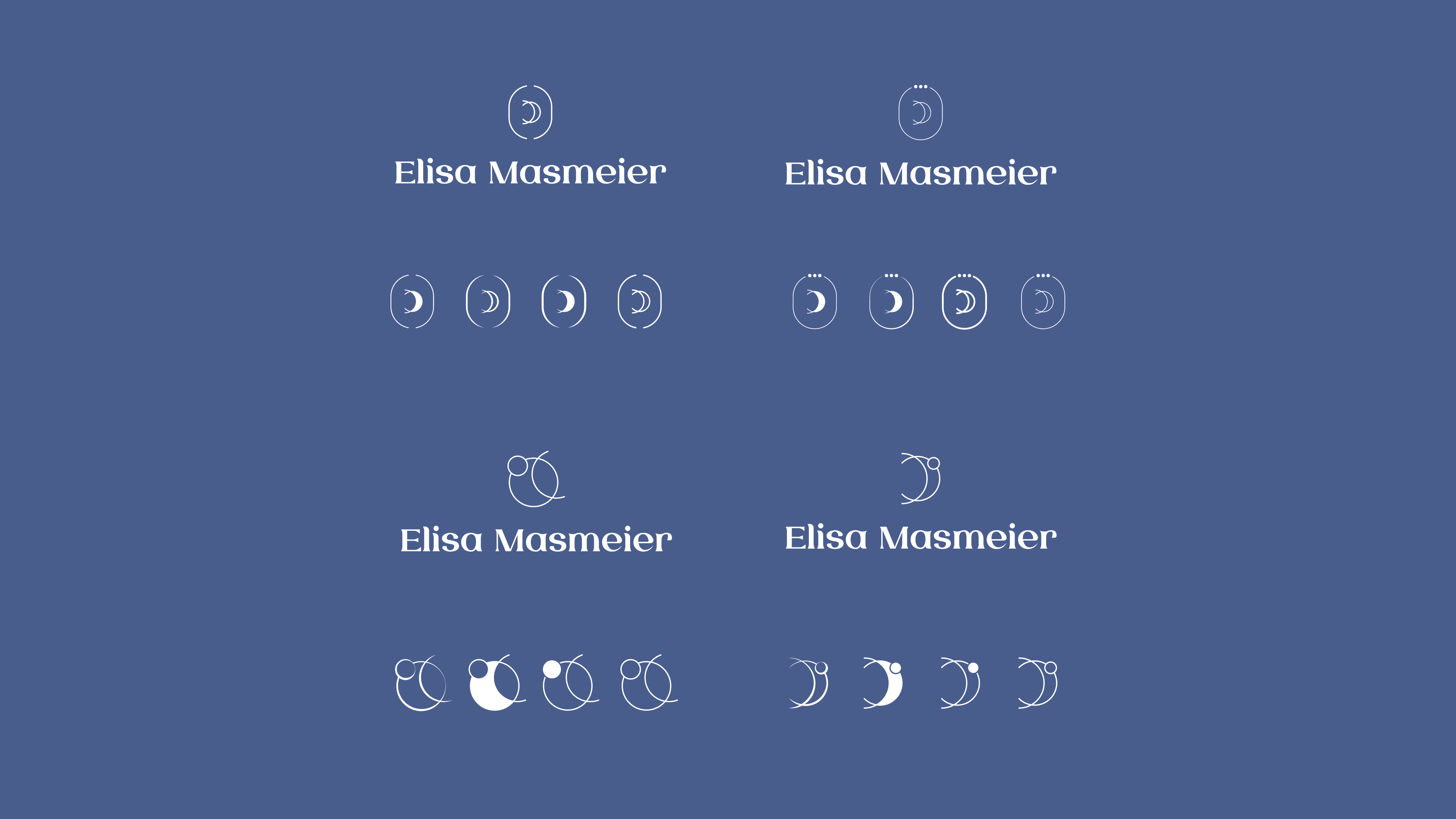
In the next step, I presented the initial concepts in a call, each combining a wordmark and a symbol. The goal was to define a clear stylistic direction. The moon symbol and a minimal, line-based style were particularly well received, so I developed further variations in that direction.
For the following round, I also created mockups to make the logo more tangible within the context of the website, since the website is the most important touchpoint here. At this stage, it was not just about presenting visually appealing logos, but also about explaining the thinking behind the elements. In addition, size, proportions, and design rules were already defined in the high-fidelity stage, rather than left to chance.
Finalisation
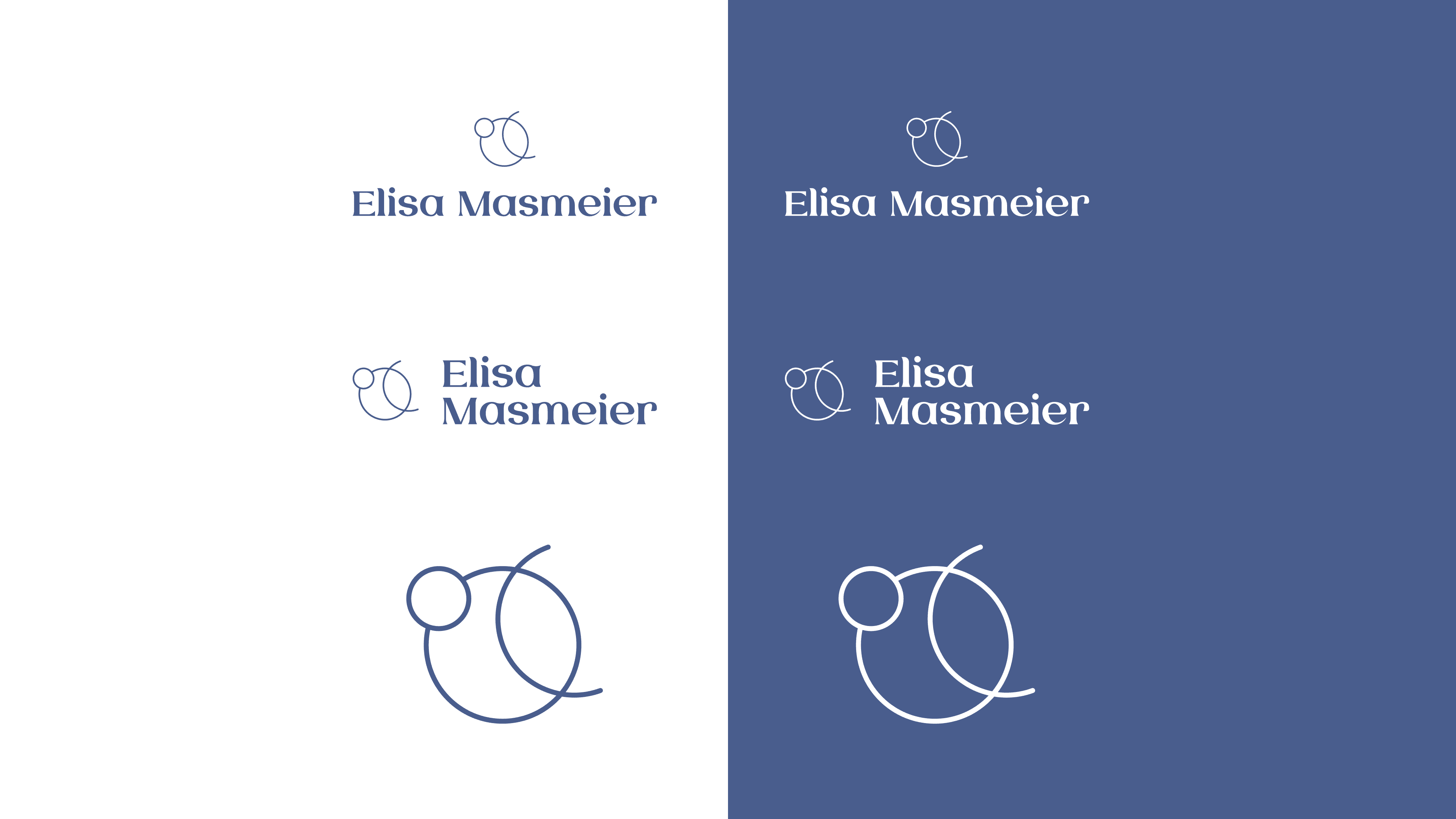
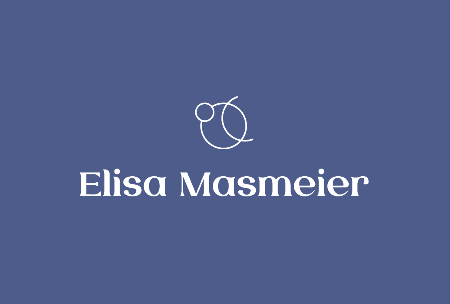
After the final round of feedback, the client chose a final logo, which I refined in detail. Spacing and proportions were carefully adjusted so that everything feels balanced and cohesive. The symbol works both with and without the wordmark, across different sizes and color variations.
We selected an abstract form combination that brings the three areas “breathwork, consulting, and bodywork” together into one unified visual system. The waning crescent moon represents letting go and completion, while the sun or planet symbol stands for natural rhythms, balance, and orientation. The delicate forms create a sensitive, refined feel that aligns with the website design.
To conclude the project, the client received a final asset package with all common formats for print and digital use. I also created an animated logo for her video production, translating the brand’s character into motion. She highlighted the collaboration as very professional and expressed that she felt completely comfortable with the final result. In particular, she appreciated the approach of first deeply understanding the brand and its values.