Over several years, I continuously improved key areas of the skatedeluxe shop. From navigation and product search to the checkout process and customer loyalty. The following projects show a selection of smaller and larger UX improvements across the entire customer journey.
Orientation & product search
Menu redesign
The old main menu was heavily nested and visually overloaded. In the redesign, the navigation was simplified and moved into a clearer horizontal structure, supported by a new icon set and a fixed utility bar. Key functions like search, login, and wishlist became easier to access. After launch, there was a small drop in performance, which was later linked to technical issues, an important learning around testing before releases.

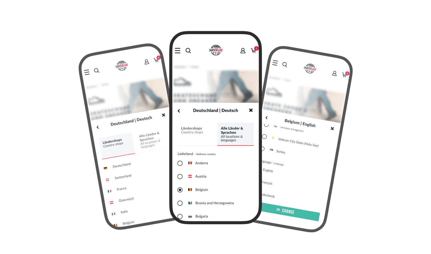
Language switch
The Language & Country switch was restructured to make the difference between country shops and languages clearer. Instead of a simple dropdown, it now has two sections: “Country shops” and “All countries & languages”. Available languages adapt dynamically depending on the selected country (e.g. multiple languages for Belgium, only English for the UK). This makes it clearer whether the user is switching a country or a language. Pro tip: flags belong to countries, not languages.
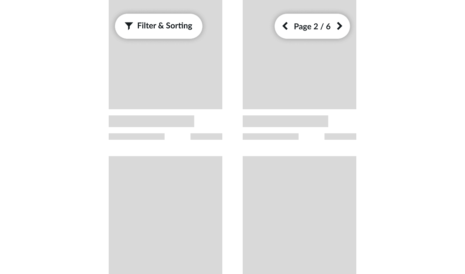
Sticky filter & pagination
In our product listings the filters, sorting, and pagination were redesigned as sticky UI elements. Instead of only being available at the top or bottom of the listing, they stay visible while scrolling as compact pill buttons.
This allows users to adjust filters and sorting or navigate between pages without scrolling back to the start or end of the list. The pagination also shows the current position directly (e.g. “Page 2 of 20”), improving orientation within the listing.
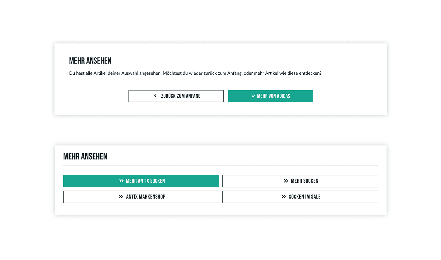
Avoiding dead ends
At the end of product lists and product pages, “dead ends” were avoided by introducing a dynamic banner with clear next steps. Depending on the context, it shows relevant options like “back to top” or “discover similar products”, with a highlighted primary button. This keeps navigation clear even at the end of a page, instead of leaving users at a dead end.
Checkout process & conversion
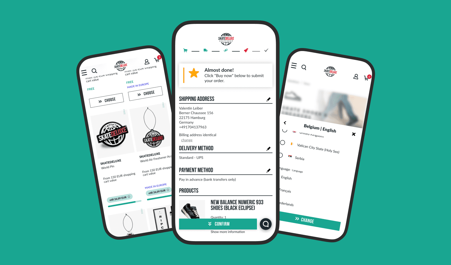
Sticky checkout CTA
A sticky “Confirm” button was introduced in the checkout to reduce long scroll distances between steps. Especially on mobile, the main CTA was often only reachable after a lot of scrolling. The sticky button acts as an anchor and jumps users directly to the final CTA at the bottom of the page. This makes the checkout flow faster and smoother.

Cart anchor on product pages
A cart anchor was introduced on product pages to speed up the start of the purchase process. Since the main “Add to cart” button is often only visible after several scrolls, a small icon button was added in the image area within the first viewport. It jumps directly to the main CTA including size selection, reducing unnecessary scrolling while keeping the essential product information in the upper section intact.
Discount display
The discount display was optimized based on UX principles around number perception. Instead of always showing either percentage or amount, the system dynamically displays the value that feels larger, either the euro amount or the percentage discount. This makes the discount more consistently persuasive across different price ranges. For example, on a 200 € product with 10% off, the 20 € savings are shown, while on a 20 € product the 10% discount is shown, since it feels stronger than 2 €.

Free products with progress bar
The existing free product feature in the cart was visually redesigned to make it more motivating and easier to understand. Instead of greyed-out and hard to interpret options, progress is now clearly shown through a progress bar. In addition, a clear remaining value (e.g. “only 10 € left”) shows how close the user is to the next reward. This makes the path to a free product shorter and easier.

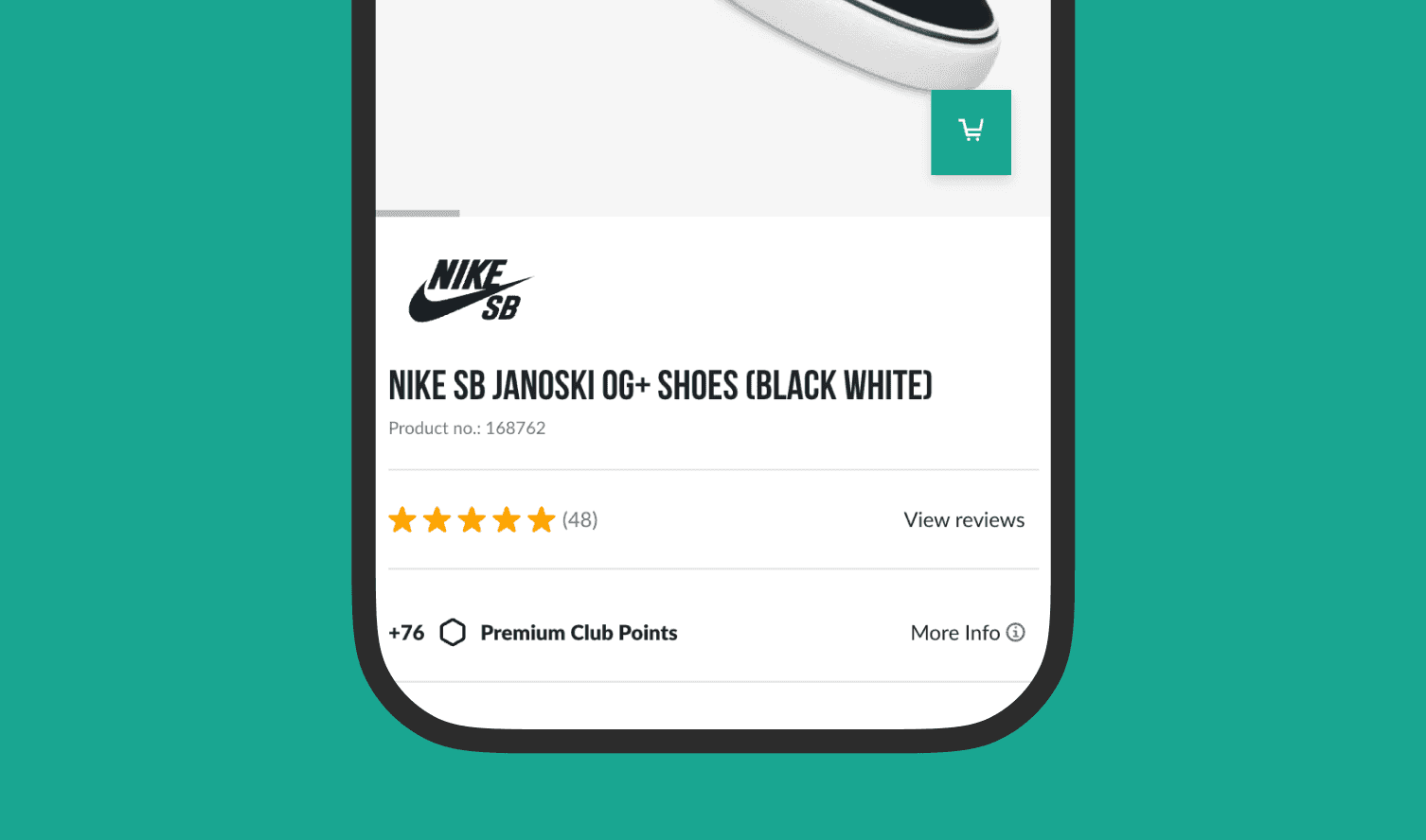
Customer loyalty
Premium Club redesign
The Premium Club was redesigned to integrate the loyalty system more closely into the overall shop experience. The existing dark premium design was modernized and brought closer to the skatedeluxe design language, while still keeping its own character. UI elements like listings, buttons, and tabs were unified and aligned with the main design system. At the same time, the program communication was simplified and the mechanics around earning and using points were structured more clearly.
